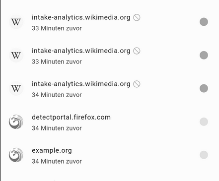
I find the Color of the Blocked domains a bit missleading.
Why is allowed gray and blue is blocked?
Could you implement a function to choose the color or change it.
Green allowed and red blocked would be nice.
That are the iode colors and imo totally ok like that
I agree it was a bit confusing at first but I like to think about it this way: grey is for nothing happening(nothing blocked, no actions), blue is for blocking turned on (just like a toggle in the settings app!)
While the color code will not change, we are currently reworking the UI of the whole app. It should look more homogeneous / comprehensive with the new design.
Hi @Antoine,
out of curiosity, do you have an ETA for the new design?
And could you please have a look at the questions I posted here?
Thank you!
Aside from the fact that I also struggled quite a bit at first and am still (briefly) irritated when using the app – has anybody checked the look against accessibility guidelines? E.g., I turned on the “Use color correction” > “Grayscale” option and there’s not that much contrast left, is it?

I know that this “form follows function” dogma doesn’t seem to be very popular in UI departments anymore — and even less so in marketing, where people think it’s the other way around — yet I really like it … ![]()
No ETA, maybe by the end of April.