Device: Devon(Moto G32)
iodeOS Version: 7.0 latest build(also 7.1 Beta)
Brief Description:
Hello iodeOS Team!
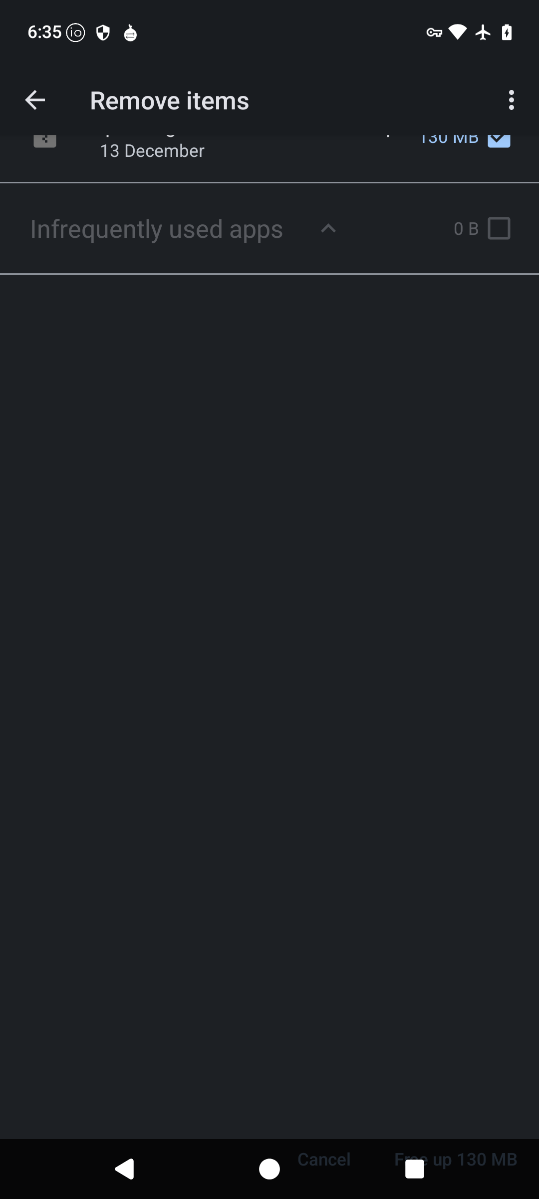
I found a bug on Storage Setting
the bug is Misallignment of UX/UI on Free up space feature
below are pictures of said issue

Hope this help and will provide logs if needed.
Thank you in advance ![]()
Step-by-step reproduction of the issue:
- Go to Setting
- then go to Storage
- click on Free up space feature
- you’ll noticed the misallignment of UX/UI
Expected behaviour: Should work normally as intended
Actual behaviour: Said issue