I don’t know how much of this is because of Iode or Android 16 or this phone model, but compared to my previous phone, I notice a lot of unused space, mostly at the sides and bottom of the screen. That also makes it harder to hit buttons, because their hitboxes end slightly before the edge of the screen, so touching the edge does nothing.
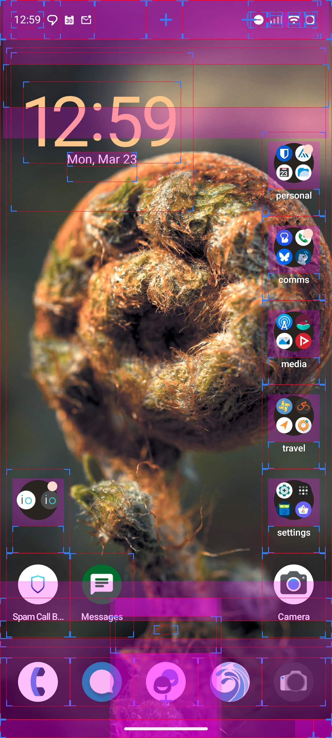
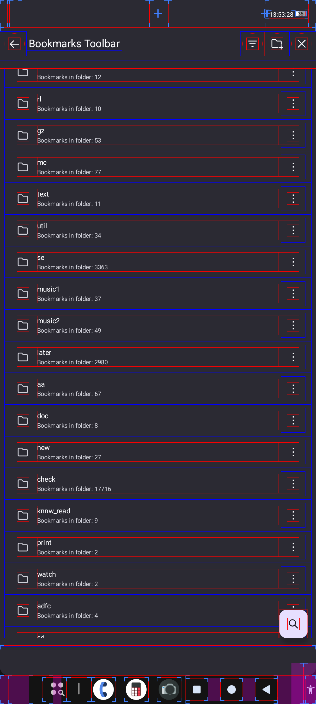
Here are some examples, with “show layout bounds” enabled:
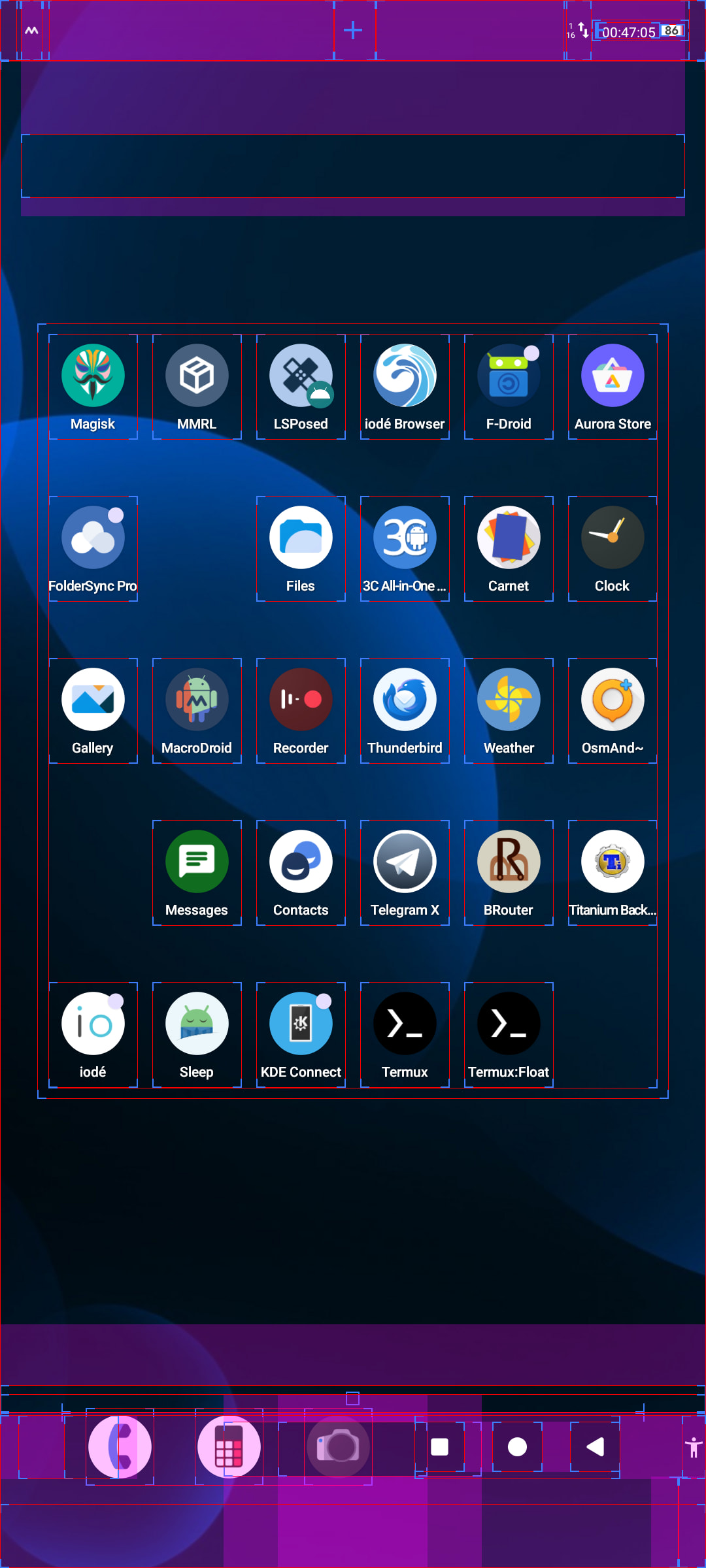
The default launcher only has 5 rows of icons, even though it could easily fit ≈8. Also, the navigation bar moves up for some reason, as if there was supposed to be something below it, but there isn’t. The only thing that’s actually at the screen edge is the accessibility button and that is so tiny that it partially disappears behind the rounded screen corners (not visible in the screenshot).
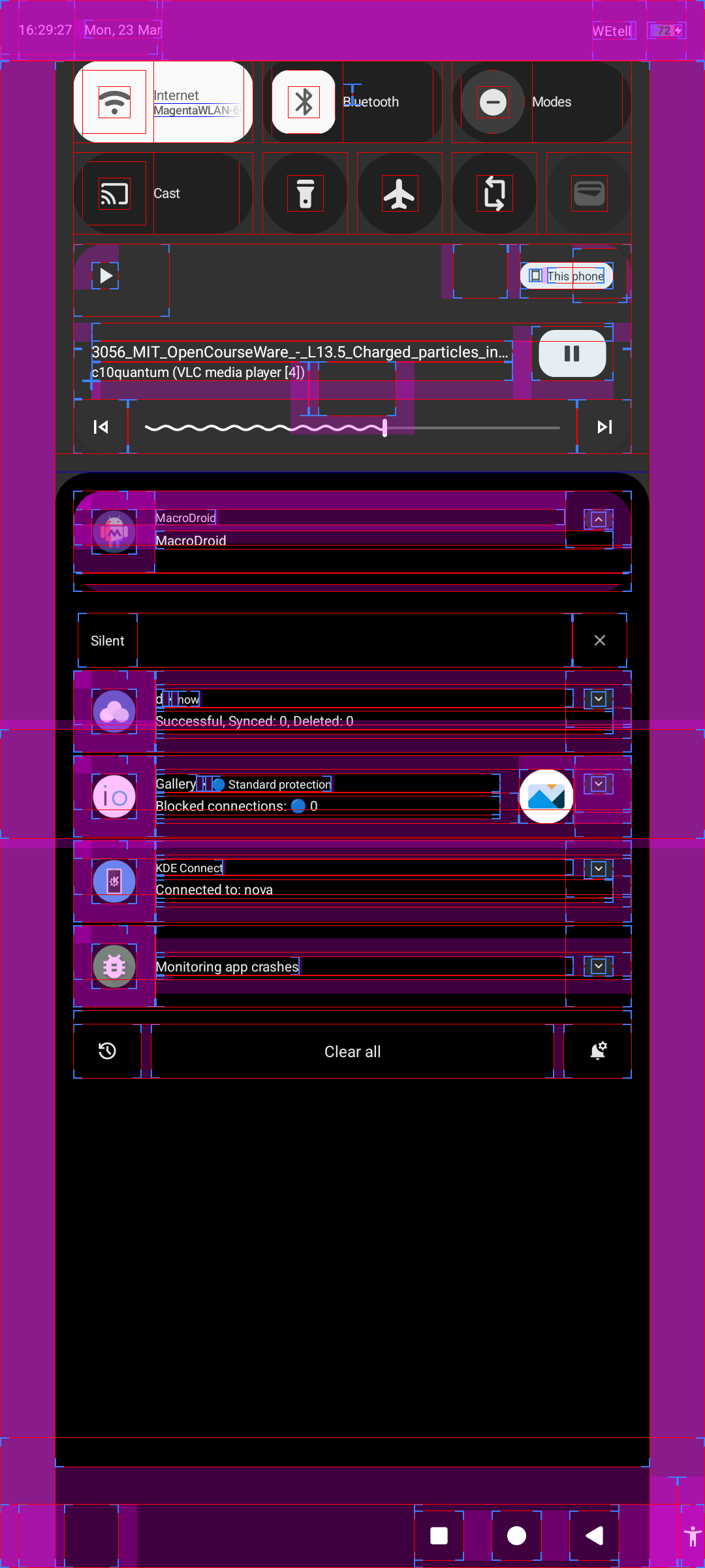
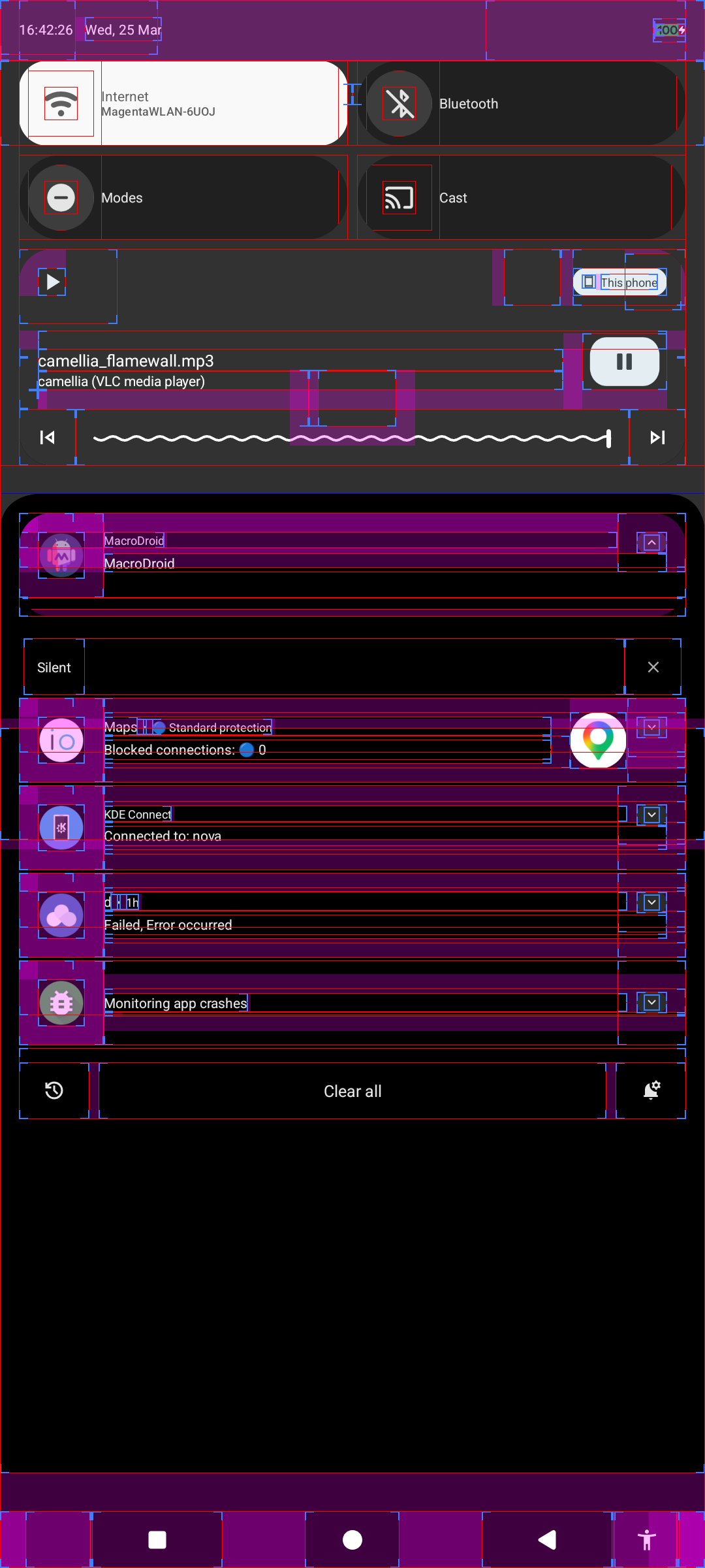
The notification area is way narrower than it could be. Clicking on the leftmost or rightmost 112 pixels does nothing. Clicking the bottom 11 pixels of almost any screen also does nothing, because the navigation bar buttons have raised hitboxes. Those especially constantly cause mispresses for me.
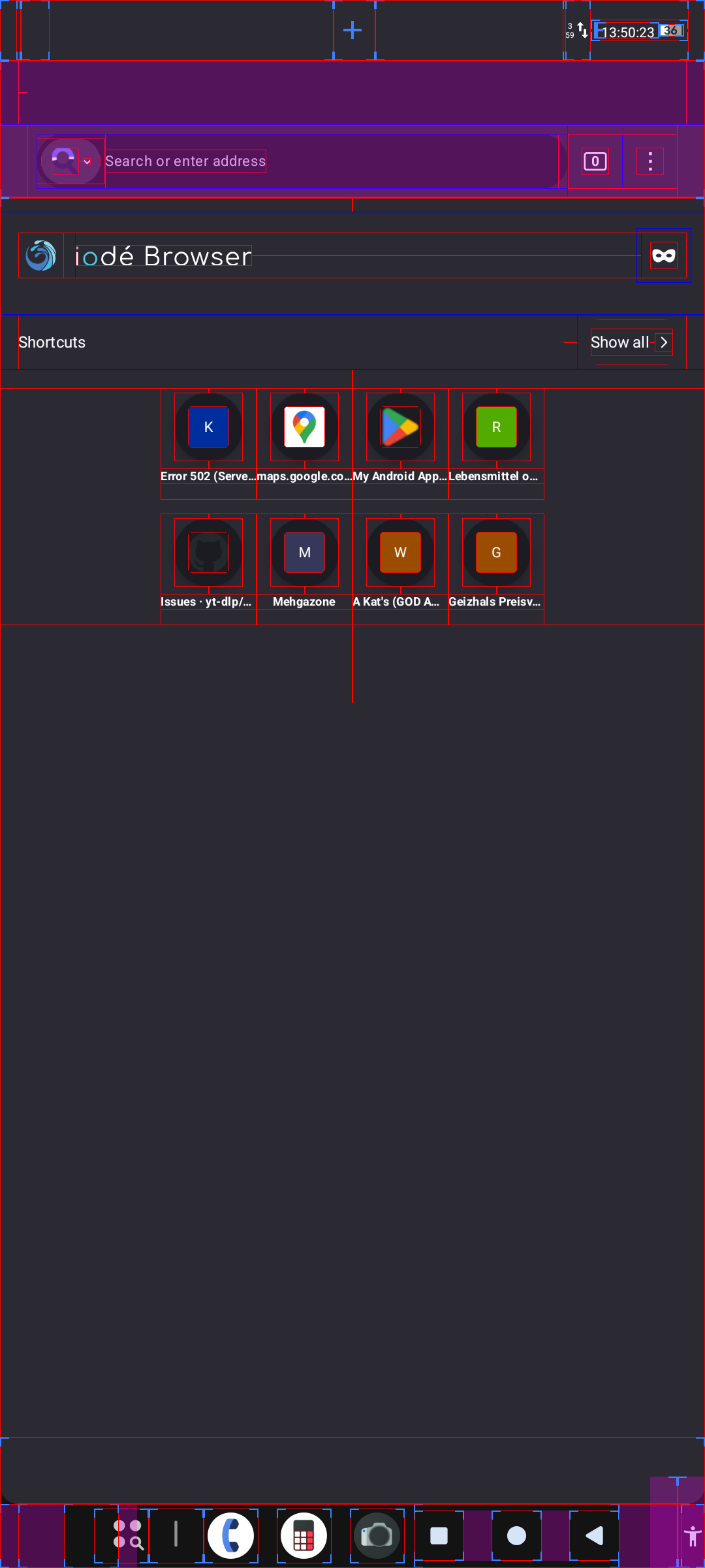
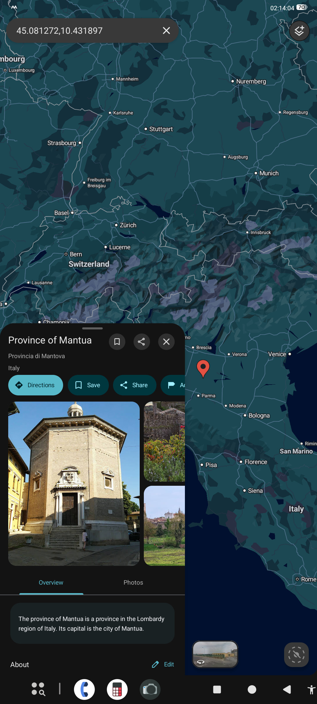
In the browser, the search provider selector and back button aren’t clickable at the left edge, the three dot menu, the incognito button and the bookmarks close button aren’t clickable at the right edge and there’s some mysterious empty rectangle near the bottom. (The empty area at the top is normal, I enabled the tab bar.)
This continues across many apps and system components.
This reminded my of this part of a Computerphile video: youtu.be/E3gS9tjACwU?t=317
On phones, it’s not quite as extreme as with a cursor, but having hitboxes at the screen edges still makes them quite a bit easier to press, it effectively adds half a finger width and the touch detection precision to the width of where you can click, making it trivially easy to hit. That’s what most of these buttons should be, so I’m surprised that so many hitboxes end shortly before it, requiring considerably more precision. I haven’t used this system while walking or on my bike yet, but I can imagine that I would really struggle to control my phone with just the slightest motion.
Is there some reason for this hitbox/UI element placement? Could it be changed in an update? I’ve tried different cutout shapes in developer options, that didn’t help, only “waterfall” made it even worse.